
What Happens When Standard Edits Fall Short
The edit begins with a diagnostic pass. I first assess whether exposure, white balance, contrast, and cropping can carry the image on their own. You must establish a solid foundation before introducing complex overlays. If the frame still feels visually flat after those standard corrections, you face a choice: force the basic sliders past their breaking point, or introduce external creative elements.
Observation data supports a specific threshold for this decision. If global contrast changes above roughly 20% still fail to separate your subject from the background, evaluate texture or filter work instead of pushing sliders further. Pushing contrast beyond that point usually degrades shadow detail and introduces unwanted color shifts. A well-timed blue hour photograph often requires minimal intervention, but a midday architectural shot might need atmospheric help.
Critical Insight: Use a recent review window of several months for comparing recent portfolio edits against older, more restrained versions. This historical comparison reveals whether your current processing habits are actually improving the final image.
Finding the optimal balance requires discipline. You want the viewer to notice the mood of the photograph, not the software used to process it.
Selecting and Preparing Textures for Blending
Texture selection is treated like location scouting. You cannot simply drop a random grunge file over a pristine landscape and expect cohesion. The chosen texture should share the image's lighting direction, tonal temperature, and apparent camera angle—files with obvious repeating patterns immediately break the illusion.
Field experience revealed that resolution mismatches destroy believability. Start with texture files at least about 30% larger than the final export dimensions so rotation, warping, and masking do not visibly degrade edge detail. Stretching a small texture file across a high-resolution sensor output creates a soft, muddy layer that ruins the underlying sharpness.
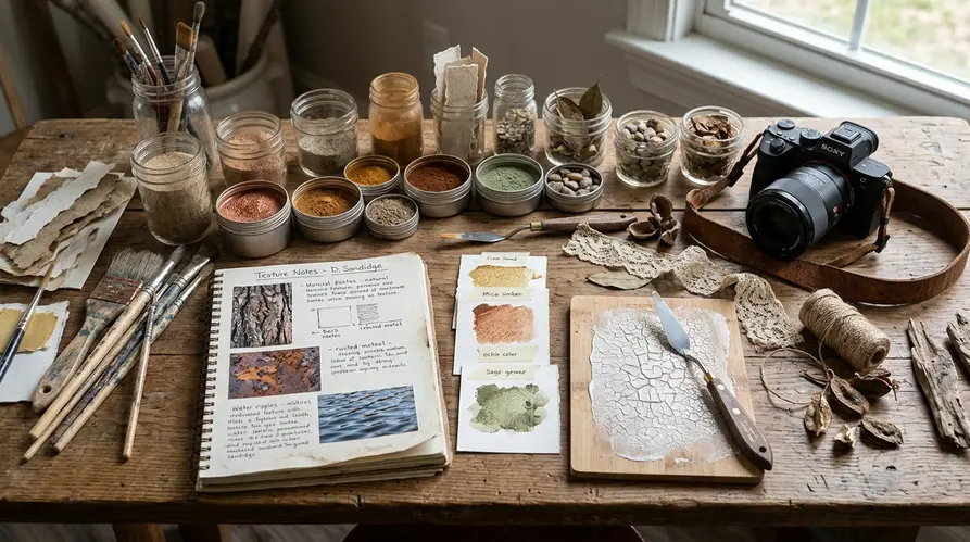
Context dictates the intensity of the application. Architectural images in older EU city centers can tolerate stronger patina and grain than modern commercial interiors, where clean lines and material accuracy are often part of the subject. A proven workflow involves preparing and testing candidate texture sets during a dedicated curation period of a few weeks. Grouping your texture preparation into dedicated sessions keeps your actual editing time focused on creative decisions rather than file management.
Applying Filters Without Losing Authenticity
Many photographers discover creative filters early in their journey, applying them as a first move to fix a boring photo. This approach rarely works. Filters are applied after the base correction and before final output sharpening, not as a rescue operation. The decision is made by applying the effect to a duplicate layer, comparing it against the unfiltered original, and masking the effect to specific tonal ranges.
Training logs show that heavy-handed filter application quickly dates a photograph. Keep global creative filter strength below roughly 25–30% when the original scene depends on natural light, and reserve stronger values for isolated areas. When using specialized suites like Nik Color Efex Pro or Nik Silver Efex Pro, I isolate the effect to the midtones to protect my absolute blacks and pure whites.
Recommendation: Run filter comparison passes over a span of several weeks when building a repeatable editing style for a series. Consistency across a body of work matters more than a single spectacular edit.
A reliable approach to filter management involves building custom presets based on your specific camera sensor's color science. This ensures the filter interacts predictably with your raw files every time.
Layer-Based Blending in Photoshop
How do you cleanly merge a concrete texture with a delicate portrait? Layer-based blending is decided by asking what the texture should do: darken corners, lift atmosphere, add age, or create surface complexity. Soft Light and Overlay are tested first for subtle integration. These blend modes respect the underlying luminosity of the base image.
Group feedback indicates that opacity control is where most editors fail. For believable texture integration, begin at approximately 35% layer opacity, then adjust in small increments of a few percent rather than large jumps. Small mathematical adjustments prevent the eye from becoming accustomed to an overly heavy effect during a long editing session.
Risk Factor: A stone-wall texture placed over a portrait may look creative at thumbnail size but becomes distracting when pores, eyelashes, and catchlights inherit the same rough surface. Always mask textures away from critical focal points.
A long exposure shot of a coastal pier might need a subtle scratch texture in the sky, but the water should remain smooth. Build layered master files within a controlled production window of a few weeks before exporting flattened portfolio versions. This separation of production and output protects your non-destructive workflow.
When Advanced Techniques Reach Their Limits
The final decision is whether the creative treatment still serves the photograph. Large layered files, stacked filters, and multiple high-resolution textures can slow review and make the image harder to manage. Technical bloat often masks a lack of visual direction.
If the layered file exceeds roughly seven times the original raw file size, archive an intermediate flattened version before adding more effects. Pushing Photoshop files into the multi-gigabyte range for a single web export is an inefficient use of storage and processing power. Audit finished creative edits across a recent multi-month span to identify repeated overuse patterns such as excessive vignette, uniform grain, or identical texture placement.
Creative Texture and Filter Control Checklist
- Confirm standard exposure, contrast, crop, and color corrections were attempted before adding creative effects.
- Use only textures with verified reuse rights, especially for EU-facing publication.
- Match texture lighting direction and tonal temperature to the base image.
Ultimately, heavily textured editing is least suitable for documentary, client-proofing, and identification-sensitive images where accuracy matters more than atmosphere. Recognize when a photograph demands strict realism and when it invites interpretation.


Reader Comments
The conversation starts with you.
Your Comment