Beyond the Screen Glow
When the Photograph Becomes an Object
The first serious print often changes the photographer before it changes the photograph.
On screen, an image can survive by being bright, immediate, and briefly persuasive. A backlit file asks for quick approval: does the contrast snap, does the color feel alive, does the crop hold attention for a few seconds? A print asks a slower question. It sits on a desk, leans against a wall, catches morning light, and keeps presenting the same decisions after the initial excitement fades.
I notice the shift most clearly when a file that seemed resolved after roughly 10–15 minutes on a calibrated monitor stays visible as a print for several days. The first viewing rewards impact. The fourth viewing exposes habits.
Scale Changes the Argument
An 8 × 10 inch print lets the eye hold the whole frame at once. An 11 × 14 inch print begins to make edge tension more obvious. A3 gives subject placement enough physical presence that a slightly crowded foreground no longer feels like a minor crop issue.
This is not nostalgia for paper. It is measurement by embodied viewing. The photograph gains boundaries, mass, and surface, so the eye stops treating it as a temporary arrangement of pixels and starts treating it as evidence.
Critical Insight: The print does not merely display the image; it changes the conditions under which judgment happens.
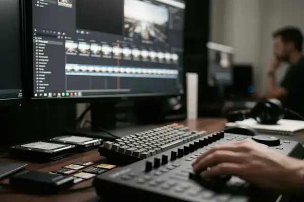
The Constraints of Screen-Based Viewing
Why Emitted Light Flatters Certain Files
A common question sits behind many print disappointments: why did the image look finished on the monitor and less convincing on paper?
The answer begins with light. A display emits light toward the viewer. A print reflects light from the room. That single difference changes color perception, shadow separation, and the apparent force of highlights. The photographer is not simply seeing the photograph on screen; the photographer is seeing the photograph through a brightness setting.
For print evaluation, a monitor is commonly brought down into the 80–120 cd/m² range rather than left at the brighter default used for browsing, email, or general editing. That adjustment does not make the screen identical to paper. It only reduces one of the most misleading advantages of the display: excessive luminance.
The Missing Variables: Texture, Size, and Viewing Distance
A 1200-pixel web preview cannot reliably describe surface gloss, fine edge contrast, or paper texture, especially when the final print reaches 13 × 19 inches or larger. It may show composition. It may suggest color. It cannot tell you how ink sits in a matte surface or how a highlight rides over a luster coating.
A print viewed under a neutral 5000K viewing lamp often reveals shadow separation, color casts, and paper-white differences that a bright display masks. A print that looks rich under a dim tungsten room lamp can appear muddy under neutral viewing light, so the insight comes from controlled viewing rather than from printing alone.
Risk Factor: If the screen remains too bright, the file may be edited for glow instead of reflectance.
This matters in infrared photography as much as in conventional color work. A false-color infrared file processed through Nik Color Efex Pro can look luminous on screen because the display pushes color and brightness directly into the eye. On paper, the same file must rely on ink density, paper white, and viewing light. The translation is not automatic.
The Physical Act of Printing
A Sequence of Commitments
Printing works best when treated as a controlled sequence rather than a final button press.
- Choose the paper before making final tone and color decisions.
- Soft-proof against the profile for that paper and printer combination.
- Make a small proof or test strip before committing to the full sheet.
- Let the print settle under appropriate conditions.
- Revise tone and color according to how the paper behaves, not according to memory of the monitor.
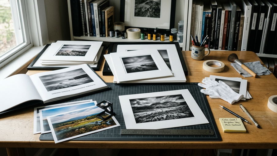
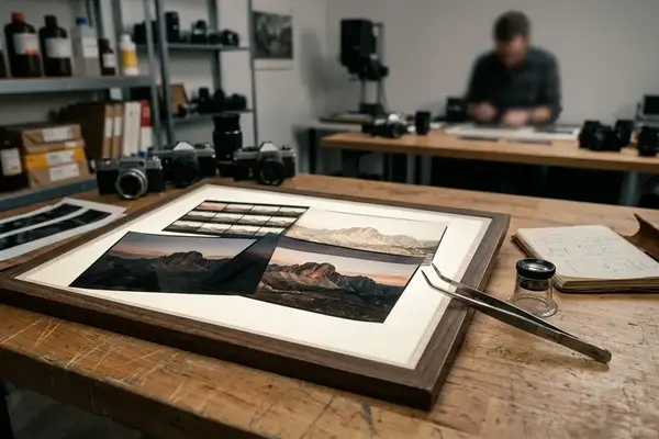
The test strip should contain the deepest shadow, a delicate highlight, and a critical skin tone or neutral area. For a Blue hour street scene, I would include the near-black doorway, a pale sign or window reflection, and a neutral pavement section. That small crop tells more truth than a full print made too early.
Paper Surface Is an Optical Choice
Paper choice controls the emotional temperature of the photograph. Matte cotton rag can make a misty landscape feel luminous and quiet, while the same paper may flatten a night photograph that needs deep black separation. Luster or baryta-type surfaces usually create stronger perceived contrast and greater black depth, which can suit Long exposure water, architectural night work, or monochrome files finished in Nik Silver Efex Pro.
Compare at least two surface families when mood carries the image: matte cotton rag for subdued tonal transitions, and luster or baryta-type papers for stronger perceived contrast. This comparison should happen with the same image, not two different photographs. Otherwise the subject matter confuses the material judgment.
Pigment ink prints also need patience. Allow them to dry down for roughly 24–48 hours before final judgment, especially with matte and baryta-style papers where density can shift after the first inspection. The first look may be useful, but it should not be the final verdict.
Recommendation: Build one proof sheet that contains the tonal extremes and the color areas most likely to fail, then judge the print after the ink has settled.
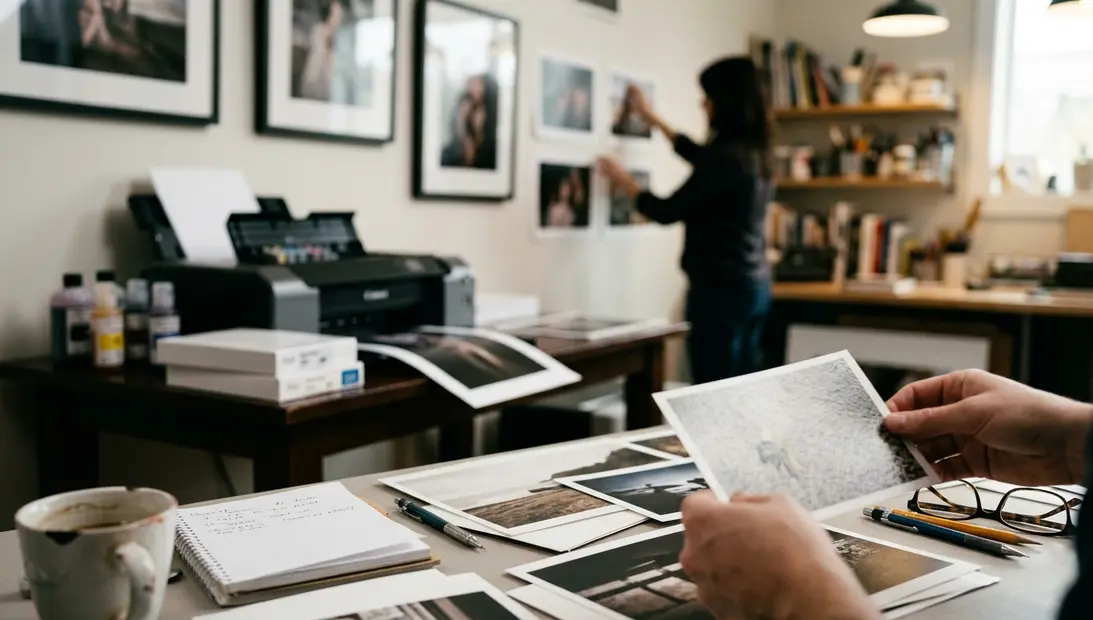
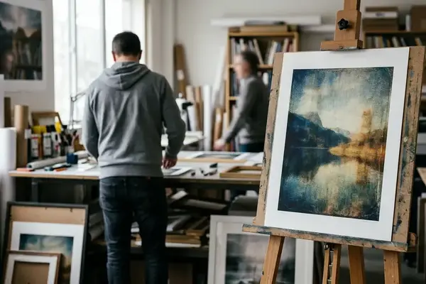
Curating a Tangible Gallery
Start by Walking the Wall
Thumbnail sorting encourages a false kind of precision. It makes every image equal in size, equal in illumination, and equally detached from the room. A physical gallery asks for a different method: walk the wall.
Start with the print that establishes visual tempo. It may not be the loudest photograph. It may be the one with the clearest tonal authority or the most stable geometry. Once that anchor is in place, quieter images can give the eye rest, and denser images can carry weight without exhausting the sequence.
For small to medium framed prints, somewhere around 3–6 inches between works gives a practical starting point. The exact spacing depends on print size, frame width, and room depth. The goal is not symmetry for its own sake; the goal is enough air that adjacent frames do not visually merge.
Lighting Decides What the Viewer Can Know
Display lighting should reveal the print without becoming part of the composition. Angle lights so glare does not fall directly into the viewer’s line of sight, particularly with glossy or semi-gloss papers. A beautifully printed dark image can become unreadable if a bright reflection lands across the central subject.
Evaluate the arrangement from two distances. Stand close enough to inspect paper surface, edge detail, and small tonal transitions. Then step back far enough to read the rhythm of the full wall. The first distance checks craft. The second checks structure.
Curating also exposes repetition. Three strong photographs with the same horizon height may weaken each other when hung together. A single image with a different tonal cadence can restore movement to the wall, even if it seemed less impressive in the editing grid.
How Prints Alter Creative Vision
The Print as Critique Partner
A print talks back quietly.
Once the photograph has mass and boundaries, small decisions stop hiding inside the editing interface. A highlight near the edge pulls harder. A dark foreground either supports the frame or becomes dead weight. An image with perfect screen sharpness can feel overworked in print because paper texture and viewing distance change how micro-contrast is perceived.
This is where print review builds creative discipline. Revisit finished prints after a week or two rather than immediately after output. Distance from the editing session often makes compositional imbalance easier to see. The eye no longer defends the labor spent on the file.
Building a Personal Standard
Keep a small group of reference prints from prior sessions. They become a private calibration set for tone, color restraint, and finishing. A new infrared print can then be judged against earlier work that already passed through the same material process.
This practice also changes capture decisions. In the field, the photographer begins to ask whether a composition will carry across a room, not only whether it will glow on a phone. Shadow placement becomes less casual. Highlights receive more respect. Texture, scale, and negative space become part of the exposure decision rather than problems deferred to editing.
The boundary is real: print-based judgment helps less when the image exists solely for fast-moving digital contexts, where small backlit-screen legibility may matter more than paper surface, ink density, or viewing-light behavior. For photographic work meant to last, though, the print remains one of the most demanding forms of review. It slows the image down long enough for the photographer to see what was actually made.

Reader Comments
The conversation starts with you.
Your Comment