

When Infrared First Spoke in Silver Tones
The Recording Medium Shaped the Look
Early infrared photography began with a physical translation. Infrared-sensitive film received reflected near-infrared energy and converted it into silver density. The resulting photograph described foliage, sky, skin, and fabric through luminance relationships rather than hue.
That recording process gave monochrome infrared its distinctive grammar. Healthy foliage often reflected near-infrared wavelengths strongly, producing pale leaves against a much darker sky. This luminance reversal became known as the Wood effect. It made familiar landscapes feel strange while preserving recognizable lines, masses, and textures.
The effect depends on the subject and the capture conditions. Leaf health, species, moisture, season, sun angle, atmospheric haze, filter cutoff, and sensor conversion all influence the response. Two green plants standing beside each other may record as different shades of gray.
Read the Foliage
Treat bright leaves as a spectral response, not a fixed color replacement. Inspect their texture and separation before deciding how white they should become.
From Silver Density to Sensor Channels
Digital capture expanded the available palette. Sensor conversion, infrared-pass filters, white-balance changes, and channel swapping allowed photographers to assign visible colors to information recorded beyond ordinary visible-light relationships. False-color infrared could now produce pink canopies, cyan skies, electric reds, and subtler combinations from the same underlying scene.
A 720 nm-class pass filter occupies an important position in this transition. It blocks most visible light while transmitting enough near-infrared energy to render vegetation brightly and skies substantially darker. The source file may support either monochrome or false-color treatment, but its strongest structural information still resides in luminance.
Digital flexibility changed the prevailing style. It did not erase the medium’s silver-toned foundation.
How Neon Palettes Became the Default—and Where They Stall
The Immediate Appeal of Color
False color announces itself quickly. Saturated pinks, cyans, and reds remain legible in a small social-feed preview, where a restrained tonal photograph may require more attention. Workshop demonstrations also benefit from an obvious transformation because the channel swap produces an immediate before-and-after difference.
That impact can conceal weak structure. At a small display size, a saturated canopy may collapse into one color block even when the full-resolution file contains individual leaves and branches. A bright palette can also distract from a flat sky, an unresolved foreground, or midtones that merge around a figure.
I inspect a prospective false-color frame in grayscale before adjusting its palette. If the visual path collapses when hue disappears, channel swapping will decorate the weakness rather than resolve it. This simple check has become more useful as infrared palettes have grown louder and more familiar.
Equal Gray, Different Hue
Two dramatically different colors can convert to nearly identical gray values. A cyan sky and a pink building may appear separate in color, then merge when their luminance is examined. The file has chromatic contrast but little tonal contrast.
Use a temporary monochrome preview during false-color processing. Trace the intended route through the frame: foreground, subject, canopy, and sky. Each major region should retain enough luminance separation to carry its role. If two adjacent areas merge, alter their luminosity locally before returning to color.
Test the Gray Path
Mute saturation and view the image at a small size. A composition that remains clear in gray has enough structure to support either a restrained palette or an intense one.
Trend fatigue begins when every frame asks saturation to supply the mood. Once electric color becomes expected, stronger photographs distinguish themselves through shape, timing, edge control, and tonal hierarchy.
Why High-Contrast Monochrome Still Carries More Weight
What Survives Without Hue?
The useful question is direct: after removing color, what remains?
Bright foliage should still frame or lead toward the subject. Openings in a dark sky should retain deliberate shapes. Architecture, skin, clothing, or a path should remain distinct through the midtones. When those relationships survive, monochrome reveals the scene’s infrared character without relying on novelty.
This approach gives luminance inversion room to work. Leaves glow against dark air. Water can become a deep visual anchor. Luminous skin or fabric separates from surrounding forms. High local contrast along branches becomes especially important because those edges describe both the canopy and the sky behind it.
Print Exposes Tonal Shortcuts
A canopy can look dramatic on screen yet fail in print when every infrared-bright leaf reaches the same near-white value, erasing depth between foreground and background layers. Large output also reveals abrupt masks, halos around branches, and empty shadows that remained inconspicuous on a backlit display.
A practical print inspection divides the image into four regions:
- Brightest leaf glow: the highest foliage values that establish the infrared effect.
- Textured light foliage: secondary leaves that preserve depth and layering.
- Subject midtones: architecture, figures, skin, fabric, or the path through the scene.
- Deep sky or water: the dark foundation that gives the luminous regions visual force.
Preserve visible distinctions among all four. Nik Silver Efex Pro can provide a focused monochrome environment for this evaluation, while a file developed through Nik Color Efex Pro still benefits from the same grayscale inspection before color decisions become final.
The gallery-oriented case for monochrome has a defined scope: scientific visualization and deliberately graphic work may use false color to carry analytical or conceptual meaning. For expressive fine-art prints, restraint often gives structure and mood more space to register.
Building a Monochrome IR Workflow That Holds Up
Begin with Highlight Protection
A beginner often meters the entire scene and then brightens the file until the foliage looks suitably luminous. Progress comes from reversing that priority. Protect the leaf texture during capture, then establish the remaining tonal relationships around it.
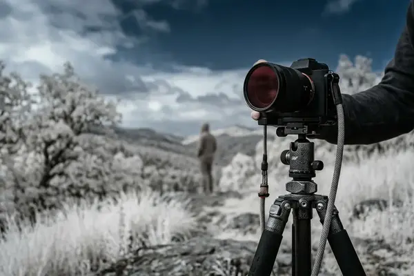
Use a stable tripod with either a converted camera or an appropriate infrared-pass filter. With an unconverted body and a dense filter, a long exposure may extend from several seconds to tens of seconds. A converted body can permit much shorter exposures under the same light. Mirror lockup or an electronic shutter helps keep the camera stable during the release.
At base ISO, bracket the metered frame in one-stop increments when bright leaves or broken sky highlights approach clipping. The brighter exposure may open the path or architecture, while the darker frame may preserve far more information in the canopy. Select according to intact detail rather than overall brightness.
Hold the Glow
Infrared-bright foliage can lose texture before the rest of the scene appears fully exposed. Judge the histogram and preview around the leaves and sky openings first.
Build Contrast in a Fixed Order
- Neutralize white balance. Establish a consistent starting point before monochrome conversion.
- Convert through a channel mix or dedicated black-and-white module. Emphasize the near-infrared luminance relationships already present in the file.
- Set global contrast. Apply a restrained S-curve that separates highlights, midtones, and deep values without flattening leaf texture.
- Darken sky and water locally. Use broad, controlled adjustments that respect fine branch edges.
- Lift selected vegetation. Dodge the foliage that guides the eye rather than raising every leaf equally.
- Protect subject midtones. Keep architecture, figures, and paths distinct from both luminous vegetation and deep surroundings.
At blue hour, the visible scene may appear subdued while the infrared relationships remain useful. The preview should guide exposure decisions through texture and separation rather than through familiar visible-light brightness.
Refine at Output Size
Advanced control begins after the global edit looks finished. View branch boundaries at full resolution, then evaluate the complete image at its intended print size. A mask that appears precise at high magnification may produce an obvious bright seam when seen as part of the whole canopy.
Gentle grain can unify smooth skies, fine leaves, and locally adjusted regions. Keep it subordinate to the image structure. Grain should give the print a coherent surface, while the four-region tonal hierarchy carries the photograph.
A Complete Walkthrough: Live Oak Canopy at Dusk
Compose Through the Sky Openings
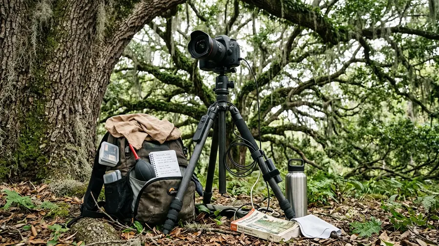
Consider a backlit live oak alley with a path running beneath the canopy and open sky appearing between heavy branches. The obvious camera position centers the path. A stronger starting point comes from watching the sky gaps and moving until those shapes support the branch structure.
Place the tripod where one opening gives breathing room above the path and smaller gaps repeat toward the distance. Fit a 720 nm filter and confirm focus before making the bracket. Use base ISO with mirror lockup or an electronic shutter.

Capture and Process the File
- Meter the scene. Pay close attention to the brightest leaves and the open sky between branches.
- Capture three frames. Make one at the metered exposure, one stop below, and one stop above.
- Select a single source frame. Choose the exposure with intact leaf and sky detail instead of blending the bracket automatically.
- Neutralize white balance. Remove the distracting capture cast so that subsequent decisions follow luminance.
- Convert to monochrome. Use a channel mix or Nik Silver Efex Pro to establish bright vegetation, dark sky, and readable path midtones.
- Apply a moderate S-curve. Set the deepest sky values first, then stop before the foreground path blocks up.
- Darken the upper sky. Add a broad graduated adjustment and inspect every branch crossing for halos.
- Lift selected foliage. Dodge the nearest leaf clusters slightly more than the distant canopy to restore depth.
- Shape the path. Hold its center in the midtones and darken the edges enough to guide attention inward.
- Add gentle grain. Judge it at the intended output size rather than at extreme magnification.
Make the First Print
Print the image at its intended display size and examine it under stable viewing light. Check the branch edges for halos, the brightest leaf clusters for clipping, the path shadows for blocked detail, and all four edges for tonal distractions.
For this live oak frame, keep the nearest leaves as the brightest textured region, hold the distant canopy one tonal step lower, place the path in a readable middle gray, and let the open sky form the deepest continuous value. If the upper-right sky edge pulls attention outward, darken that edge locally, reprint, and repeat the same four checks. The finished print will lead from the illuminated foreground leaves, along the open path, and into the layered canopy through luminance alone.







Reader Comments
The conversation starts with you.
Your Comment