
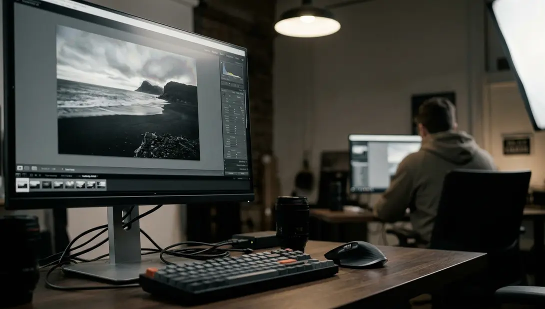
The file looked finished on screen. A cathedral interior, a five-bracket sequence, stone the color of wet sand, the three lancet windows burning at the far end. Then it came back from the printer at just over twenty-four inches wide and every mullion carried a pale rim, as if someone had traced the glass with a soft pencil.
A Pale Rim Along the Mullion Ends the Print
That ring is the single most expensive artifact in high dynamic range work, because it survives everything you do afterward. Sharpening makes it crisper. Dodging makes it brighter. Converting to monochrome in Nik Silver Efex Pro only changes its color, never its presence. You end up paying for a second print, revisiting the bracket set, and explaining to a client why the light in the frame reads as processed rather than observed.
Judge the mapping by a single question: after the luminance range has been compressed into something a printer can hold, do stone, glass, and sky still meet along a clean edge? When the answer is yes, you get the thing HDR actually promises — a shadowed nave and a bright window in the same frame, both legible, neither announcing the software that produced them.
Check the intended print dimensions before approving anything. A boundary that behaves at web size is not evidence.
The Neighborhood Problem: How Local Operators Build a Ring
Local tone mapping works by comparing each pixel to the pixels around it. That comparison is the whole mechanism, and it is also the whole problem. Place a bright window beside dark stone and the operator reads an enormous local contrast across that boundary; it responds by lifting the dark side and pulling down the bright side, in a band whose width is set by the radius control. The band is the halo.
The three controls have to be judged together, never a single one at a time:
- Radius — a small radius concentrates the adjustment into a narrow, highly visible band right at the edge.
- Strength, determines how hard the operator pushes inside that band.
- Microcontrast, amplifies fine detail everywhere, including the detail that is really just the edge of the ring.
A small radius combined with strong local contrast is the classic failure, and it is conspicuous exactly where photographers love to shoot: window frames, night architecture, a ridgeline against blue hour sky. Global and photographic operators compress the entire histogram instead, so they rarely ring at all. Left alone they can read flat through the midtones, which is a different and far more fixable complaint.
What Happens in a Dedicated Mapper Before Color Enters
Why reach for a standalone application when a host plugin sits right there in the editor? Because the plugin usually collapses smoothing, halo reduction, and lighting behavior into a single strength slider, and that slider cannot separate the decisions that produce a ring from the decisions that produce detail.
A dedicated mapper exposes those controls individually, and more importantly it can map luminance independently of chroma. That separation matters: a colored fringe often rides along with a halo, and once the two are entangled you are masking the two artifacts instead of preventing a single one.
Keep the merge in 32-bit linear form straight through the mapping stage. Converting to 16-bit first bakes the compression decisions into the file before the mapper ever sees the scene luminance, and the ring comes with it.
What Mapping Cannot Recover — no operator rebuilds a channel that clipped in every source exposure. If the highlight or shadow information is absent from the brackets, the mapper can only redistribute what survived. Fix that on the tripod, not in the software.
Halo-Safe Starting Points in Photomatix, SNS-HDR, and easyHDR
Photomatix
Begin with Contrast Optimizer or Tone Compressor rather than an aggressive Details Enhancer pass. Treat Strength and Lighting as a pair — when both sit high, edges glow. If a mullion starts to rim, raise smoothing and ease microcontrast before you touch anything else.
SNS-HDR
Leave halo suppression engaged while you resolve the boundary on interiors and night streets. Get the edge clean first. Local contrast is an addition you make to a working file, not a setting you fight the suppression with.
easyHDR
Start from a task preset chosen for the scene type — interior behaves nothing like open landscape, then confine any added contrast to midtones. Mask it onto masonry, foliage, or fabric, deliberately away from the bright-to-dark transition.
Across the three applications, the inspection order is the same: look at the window edge before you add midtone contrast, not after.
When to Compress Globally and When to Let Local Detail In
For extreme brackets, map globally first. Interiors with windows, night streets, a long exposure that holds both a lit facade and an unlit alley — these are scenes where the global pass gives you a baseline with nothing ringing. Only then ask whether textured midtones genuinely need masked local detail.
The reasoning behind photographic operators is laid out in Reinhard and colleagues' 2002 paper on photographic tone reproduction: compress scene luminance the way a print does, rather than treating every edge as a detail waiting to be amplified. That framing is the practical difference between a file that looks photographed and one that looks filtered.
When you compare the two renderings, compare the four things — edge cleanliness, shadow noise, color neutrality, and highlight roll-off. And compare them at the size the image will actually be seen. A rim can vanish entirely in a web-sized rendering and reappear along the same boundary on a large inkjet.
Merge, Map, Mask, Sharpen — in That Order
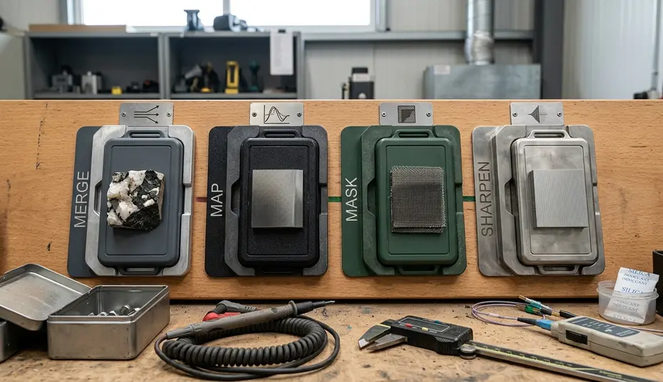
The sequence is short and it is not negotiable. Merge to 32-bit. Map globally. Add local contrast under a mask, restricted to midtone texture. Sharpen last, because sharpening is an edge amplifier and any ring still present becomes permanent at that step.
Then inspect at the 100 percent level along every high-contrast boundary. A 25 percent preview flatters the file and hides a narrow band completely — files that read as crisp at screen size and glow along window frames on paper are a recurring theme in workshop print critiques, and the pattern holds across software.
Inspect at Full Size — walk the cursor along each bright-to-dark transition at the 100 percent scale after sharpening and before export. A single pass catches most of what a reprint would have cost you.
Choose the Clean Edge Over the Full Histogram
Here is the position I will defend: default to a photographic or global operator on every extreme bracket set, and introduce local contrast only as a masked addition to midtones that actually carry texture. A histogram that fills the box end to end proves nothing if a ridgeline glows.
Reject any result with a visible ring, however impressive the detail elsewhere. For a print, an exhibition wall, or a client delivery, hand over the slightly flatter file with clean edges every single time — that one will still look like a photograph in upward of five years.











Reader Comments
The conversation starts with you.
Your Comment