Interior color fidelity fails quietly. A file can look balanced at first glance, with visible window detail and open shadows, while the room’s material logic has already shifted. Neutral paint warms near a lamp beyond what the eye would accept. A charcoal textile lifts until it competes with a dark wood surface. The question is not whether HDR brackets can reveal detail; they often can. The harder question is whether the method preserves believable color relationships under mixed light.
Deborah Sandidge’s workshop audience would recognize this problem quickly because it resembles field decisions in Long exposure and Blue hour work: the exposure may be technically generous, yet the color can stop feeling true. Interior HDR asks for the same discipline. The capture method must serve the room, not merely expand the tonal inventory.
The Fidelity Question in Mixed Lighting
What the test was really asking
The practical question was simple: which capture method keeps the room’s color relationships believable when tungsten table lamps, daylight from windows, and darker transition zones all occupy the same composition?
That framing matters. Many HDR comparisons reward the file that shows more visible detail. Interior editorial critique rewards a different standard. The walls, fabric, trim, and furnishings must still relate to one another in a way the viewer accepts as spatially and materially coherent.
Mixed-source interiors create the stress case because each light source pulls color in a different direction. Warm practical lamps push red and yellow into nearby neutral surfaces. Window spill introduces cooler values across paint, upholstery, and polished edges. Under furniture or cabinetry, darker transition zones hold both color contamination and low-value texture, so the file has less room for correction before relationships collapse.
Where HDR brackets begin to drift
The most visible tonal shifts appeared where warm practical lamps overlapped with cool window spill, especially on neutral paint and fabric. Those surfaces expose capture problems because they do not provide the visual forgiveness of saturated décor or intentionally stylized grading.
HDR brackets can introduce tonal shifts that were not present in a single raw exposure. The shift may not announce itself as an obvious color cast. It often appears as a small disagreement between adjacent zones: a wall beside a lamp warms faster than the wall facing the window, or a pale fabric no longer reads as the same material across its folds.
Critical Insight: In mixed interiors, fidelity means preserving relationships between surfaces, not maximizing visible detail in every corner of the frame.
Micro-contrast also enters early. Shadow transitions around chair legs, cabinet bases, and cushion seams lose authority when merge rendering pulls one area from a darker frame and a neighboring area from a brighter one. The image may remain sharp at normal viewing size, but the room starts to feel less dimensional.
Controlled Bracket Comparison Setup
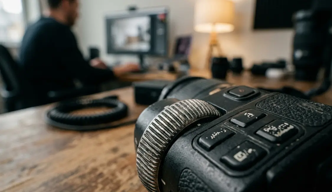
Removing the camera as a variable
The comparison needed restraint before it needed software. Camera position, focal length, aperture, ISO, and white balance were locked before the bracket run and left unchanged for the single-frame test. That choice narrowed the question to capture method and rendering behavior rather than operator variation.
The HDR test used a 5-stop bracket sequence centered on the base interior exposure. The single-frame comparison used one raw capture with supplemental flash balanced low enough to lift the room without making window light feel like a separate layer. White balance stayed fixed across the sequence instead of being recalculated per frame.
A beginner might first ask whether the brighter file wins. The more useful progression is to ask whether each surface keeps its place in the room. At the advanced end, the reviewer watches individual red, green, and blue channels before applying a finished look in Nik Color Efex Pro, Nik Silver Efex Pro, or any other stylizing tool.
Why flash balance mattered
The single exposure had the fidelity advantage mainly when the flash remained subtle. Heavy flash can overpower ambient direction and make an interior feel less truthful than a restrained bracket. The relevant comparison was not HDR against a theatrical flash frame; it was HDR against a disciplined flash-blended raw file.
Field experience revealed that this distinction changes the critique. A low flash lift can support shadow information while preserving the directional logic of window and lamp light. Once flash becomes the dominant source, it solves one problem and creates another: the room may become cleaner, but less believable.
Recommendation: Lock white balance and camera position before comparing methods, then judge the files before stylized grading. A finished preset can hide capture behavior that still affects color-critical interiors.
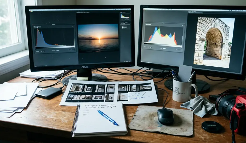
Raw histograms were checked before tonal styling, with attention to individual channel behavior rather than only the combined luminance graph. That sequence kept the review close to capture behavior. It also prevented a pleasing global edit from masking early channel separation.
Histogram Data and Tonal Distribution
Reading the channels, not the mood
The histogram review was not a beauty contest between bright and dark files. It asked whether the merge changed relationships between zones that should have stayed visually distinct.
In the bracket merge, highlight compression could create channel clipping in small bright areas that remained separable in the single raw frame. This is a critical failure case because the merged file can look clean and evenly exposed while lamp highlights have already lost recoverable channel structure. The viewer sees a tidy room; the histogram shows a less stable color record.
Shadow recovery created a second kind of shift. It pulled low-value areas upward, but it also narrowed the distance between deep shadow, dark textile, and mid-tone wall paint. When that spacing compresses, the room’s material hierarchy weakens. A dark wood chair, a charcoal cushion, and an adjacent painted wall begin to occupy values that feel too similar.
Mid-tone spacing as a fidelity marker
The single flash-blended frame kept the histogram less dramatic, but the mid-tone spacing stayed more coherent across walls, trim, and furnishings. That coherence carried more editorial value than a wider-looking tonal spread.
Color channel separation appeared most clearly in neutral surfaces beside warm fixtures. In the merge rendering, the red channel rose independently from the blue channel. That behavior explains why a neutral wall near a lamp can look plausible in isolation but wrong when compared with the same wall across the room.
This point challenges a common HDR habit. A smooth combined luminance histogram does not prove that color relationships survived. Interior fidelity requires channel-level inspection because mixed tungsten-daylight scenes often fail through separation before they fail through obvious exposure error.
Risk Factor: Shadow detail recovered from bracketed frames can make dark wood, charcoal textile, and adjacent painted wall appear too similar in value, reducing the room’s material hierarchy.
Micro-Contrast Behavior in Practice
Edges reveal what global exposure hides
The micro-contrast check moved away from global exposure and looked at edges: chair leg against rug, cabinet stile against shadow, woven fabric against cushion seam, and stone edge against painted wall. These boundaries carry the physical truth of an interior. When they soften, the room loses tactility before it loses apparent sharpness.
Softening was most apparent at material boundaries where one side of the edge came from a darker bracket frame and the other side was influenced by a brighter frame. The problem did not need visible ghosting to matter. It showed as a slight flattening of local separation, particularly in low-value transitions.
Fine texture on fabric, matte wood grain, and rug weave showed greater risk of flattening as bracket count and merge intervention increased. That risk does not make HDR unusable. It does mean that every added bracket gives the merge engine more authority over the local relationships that a photographer may want to protect.
The sharper file is not always the louder file
The single-frame file preserved crisper local contrast in shadow transitions, especially where flash provided modest lift without erasing the original direction of ambient light. This result can surprise photographers who expect HDR to produce the more complete file. Completeness and fidelity are not the same standard.
At screen size, a bracket merge may look sharp. Under close inspection, material edges can feel less dimensional. The eye notices this as a loss of surface distinction rather than as blur.
A practical review should therefore move in stages. First, compare neutral surfaces beside mixed light. Next, inspect shadow transitions where dark objects meet darker backgrounds. Then check textured materials that carry the room’s tactile identity. If the bracket merge wins only on global brightness while losing these local tests, the single exposure deserves serious consideration.
Scope and Limitations of Findings
Where the conclusion applies
The findings should remain deliberately narrow. The purpose is not to declare HDR unusable, but to identify when it stops serving color truth in interiors.
The most relevant condition is a mixed tungsten-daylight interior with visible practical lamps and window spill in the same composition. Within this lighting geometry, the single flash-blended raw frame often preserved more believable mid-tone relationships and sharper local contrast than the 5-stop bracket merge. A room lit by one consistent source, or a stylized real-estate workflow where color fidelity is secondary, may justify a different choice.
Lens flare control, sensor highlight latitude, raw converter behavior, and the merge engine’s tone-mapping defaults can all change the final balance. Recent editing software updates changed default HDR rendering behavior enough that older presets should be rechecked before relying on them for color-critical interiors.
A decision rule for field use
The practical decision is situational. If the room contains warm practical lamps, cool window spill, and neutral surfaces that must remain believable, the photographer should test the single-frame flash blend before committing to HDR. If the bracket merge produces a cleaner global exposure but weakens lamp-adjacent neutrals, shadow hierarchy, or material edges, it has solved the wrong problem.
When HDR remains the better choice, the file still deserves channel-level review before finishing. When the single exposure wins, it usually wins by restraint: fixed white balance, modest flash, coherent mid-tones, and local contrast that keeps surfaces physically legible.
Interior color truth depends on relationships. The best capture method is the one that protects those relationships under the specific light in front of the camera.


Reader Comments
The conversation starts with you.
Your Comment